At the end of 2023, the Office of Digital Communications purchased the Nielsen Norman Group (NNG) University Websites research report, 2nd Edition, which is focused on providing a better user experience for students, faculty, peers and external visitors.
Our office leans on organizations like NNG that conduct the thorough user testing, surveys and evaluations necessary to guide UX and content strategy best practices.
Our first post citing the NNG report addresses a key finding: Prospective students often have the same four questions when visiting a university website.
Answering these questions should be the main objective of every university website, to whatever degree they may be applicable.
1. Do they have the major or program I'm interested in?
The most important factor driving student interest in a particular university is whether it has the program they are looking for. If prospective students don't find this information, they assume the program isn't offered at all.
NNG found more than half of prospective students do not realize that a major or program of their choice is being offered even when it is listed somewhere on the website.
So how do we fix that? Transparency.
All information you want prospective students to see should be easily visible and easily accessible. The general rule of thumb is "Get the first click right." Within one click, students should, at the very least, know where the information they want is located. Every click, form and request for information is a barrier to students knowing what they want to know.

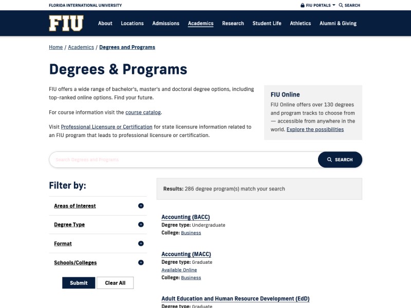
A great example of a degree list can be found right here at FIU on our Degree Finder. It makes the entire program list available upfront, all while providing a search function and filters to make it easy to find what you are looking for as a prospective student.
2. Can I afford this major or program?
Niche's Class of 2024 Fall Survey, based on a total of about 24,000 responses from graduating high school seniors, found that 89% of students identified price as a significant factor affecting their likelihood to even inquire about the college.
There is no doubt that cost and return on investment are primary concerns for students deciding where to enroll. What university they attend and what program they choose often comes down to dollars and cents.
Yet, details such as cost of attendance and employment after graduation are hard to find or entirely nonexistent on many websites.
Prospective students appreciate honesty. Make sure all information, just like with the programs, is freely available and easily understood. If your college has a special scholarship, list it. If your department's new certificate program costs X amount per year, list it.
Gating information
Do not hide this information behind any sort of form or sign-up. Not only is this bad practice, but it violates Regulation 7.001 from the Florida Board of Governors which states "All tuition and fees...must be prominently posted on the state university’s website in an area that is transparent and easily accessible."
Outcome and Return on Investment
Students care about more than just costs, however. They want to know whether the investment in a program will be worth it in the end. Justifying costs comes down to a few best practices:
- Highlight activity. If your department just published a big research project or won a prestigious award, then be sure to mention it. Students like knowing where their tuition is going!
- Show positive outcomes. Like most of us, prospective students want assurance that their education will translate to steady employment, good pay and further opportunities.
- Provide the numbers. Prospective students appreciate the effort you put in to give them the "big numbers" associated with their college educations. Tuition, program length and any other statistics are not useful if they are buried in a table three clicks away from the program page.
- Provide sources. Sourced data goes a very long way in convincing students at a glance. Even if they don't read the source material itself, the presence of well-sourced information gives credibility to what you are conveying.

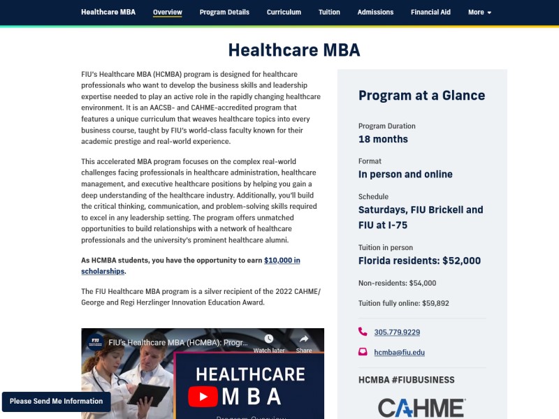
Take a look at the MBA in Healthcare from FIU Business. In a single landing page, FIU Business highlights a recently won award, provides a glimpse into the positive benefits of the program and gives all the program's "big numbers" immediately. Prospective students can use the navigation bar to read more, but the one-page summary ensures that they get the first click right.
3. Will I be admitted?
Time is as much a resource as money. Prospective students don't want to waste time writing cover letters and ordering transcripts for programs they believe they have no chance of being admitted to.
We must emphasize the exclusivity of our programs without turning away strong candidates. That can be difficult without explicitly providing admissions statistics.
An easy way to answer this big question is to provide sample cover letters, a class profile, average SAT scores, number of first-generation students and other details that provide a clear picture of what is and isn't "good enough" to get into your program.
In other words, students want to know whether their qualities will hold them back from becoming part of the Panther Family. Chances are they are underestimating their own value, so we should help them out and make sure that does not happen.
4. Will I fit in?
Students quickly form initial impressions of the university culture. They use the website as a magnifying glass to see who is going to the university, what the university is doing and how they will fit into the culture.

Show, don't tell.
Photos and videos are the most striking part of any website and present a great opportunity to show your college, school or department's mission and values without explicitly saying so.
Words are a powerful tool in website design, but visuals are often what get students to written content in the first place. So the next time your department has a momentous event, give prospective students an image that captures the moment.
Show excellence with videos of your students and faculty winning awards. Show diversity with photos of your many students attending a lecture together. Show vibrancy with virtual tours of your campus and buildings.

Be honest. Be authentic.
When you look at the above photo of President Jessell interacting with staff, it might not be your No. 1 pick for a news story cover. This photo, however, would be a big hit with prospective faculty. Why?
The fact of the matter is website visitors want "real" content and imagery that is reflective of a university, school or program's values and culture. Carefully optimized marketing material is seen as just that, carefully optimized.
Let's think about when we're showing (and not telling) aspects of student life, as an example. Common sense nudges us toward a classic: three students posing outside, arms around each other and smiling at the camera.
On the other hand, we might consider heading to the dining hall. A photo there will undoubtedly catch students in all their glory: one right in the middle of sneezing, another with a mouthful of cereal and another laughing at their friend's joke.
Of the two, it is the second photo in the dining hall that prospective students are looking for. The photo lets them know "Hey, these are real people and this is the real FIU."
What's next
This post is the first in a series that will focus on the university student experience, based on the latest research compiled by our team through literature, conferences and user testing.

