There are different ways to make text more noticeable and impactful. We can do this by italicizing it, making it bold, or by adding color. It is important to ensure the emphasized text is clear and accessible to screen readers using proper HTML tags.
Italicizing text
Italicized text is one of the ways to emphasize certain words or phrases in a paragraph like book or magazine titles. While not an explicit accessibility rule, it’s best to avoid italicizing large chunks of text. Siteimprove, for example, will flag full paragraphs in italics.
If you want a screen reader to pronounce the italicized text with emphasis, use the
<em> tag. The keyboard shortcut for italicizing text is Cmd + I on Mac and Ctrl + I on Windows.
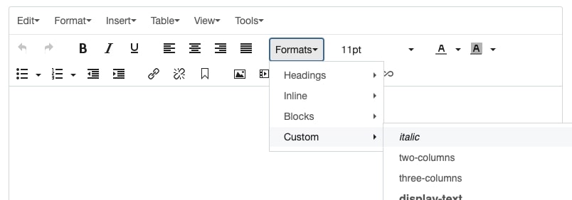
If you're italicizing text just for visual effect, use our custom helper class, italic: class="italic". You can find this helper class in the Formats menu in Cascade.

Bolding text
Bolding text is another way to highlight important words or phrases in a paragraph.
If you want a screen reader to strongly emphasize the bolded text, use the
<strong> tag. This tells the screen reader to pronounce the text with added emphasis. The keyboard shortcut for bolding text is Cmd + B on Mac and Ctrl + B on Windows.
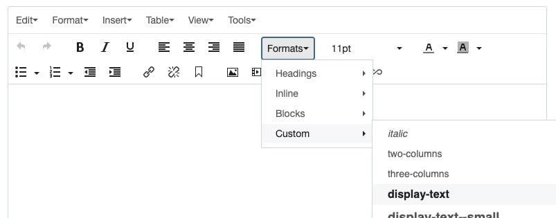
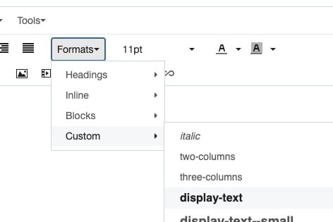
If you’re bolding text just for visual effect, use our custom helper class, display-text: class="display-text". You can find this helper class in the Formats menu in Cascade.

We’ve also included three additional custom helper classes to help you bold and adjust text size.
| Diplay text example | Custom class name |
|---|---|
| Display text small | display-text--small |
| Display text medium | display-text--medium |
| Display text large | display-text--large |
It’s best to use these helper classes for labels or when you need to adjust the sizing of your headings.
Why can’t I use Headings instead?
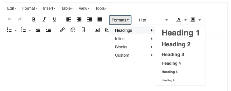
In Cascade, you will find a set of Headings under the Format menu. These headings help organize the structure of your web page, kind of like a table of contents. They also play a key role for screen readers by clarifying the hierarchy of the page, which improves navigation for users who rely on these tools.
Heading styles come in various sizes, 1-6, from large to small, and use specific tags in the page’s code. Without these tags, screen readers can’t identify what’s most important, which can make for a frustrating user experience. Heading styles should not be used to make the text size larger or smaller.

For more information on using Headings, check out our headings/headlines tips in Pantera.
Why can’t I use all caps?
Using all caps can make text harder to read, especially for users with dyslexia. Screen readers often interpret all caps as acronyms and spell out each letter. It's best to use all caps for abbreviations and acronyms.
Adding color to text
Adding color to text is another way to highlight specific words or phrases in a paragraph.
We’ve set up three custom CSS helper classes for changing text color to gold, magenta or cyan.
- .fiu-gold
- .fiu-magenta
- .fiu-cyan
You can apply these classes to headings, paragraph text, labels and any other content on your page.
When using color, make sure there’s good contrast between the text and background color to ensure accessibility for all users.
| Color Combinations | Colors Used | WCAG Pass/Fail |
|---|---|---|
|
White text |
Text color: #FFFFFF Background color: #081E3F |
|
|
Gray text |
Text color: #333333 Background color: #FFCC00 |
|
|
Blue text |
Text color: #081E3F Background color: #CC0066 |
|
|
White text |
Text color: #FFFFFF Background color: #00FFFF |
Use Web AIM’s color contrast checker to confirm your color combination meets WCAG AA and AAA standards.
When it comes to emphasizing text, remember less is more. Avoid bolding, italicizing or adding color to every word or phrase. Be selective and apply these styles on where they make a real difference.
Additional Resources
- Accessbility: The use of emphasis in text, Siteimprove
- All-caps Headings: are they bad for accessbility?, Bureau of Internet Accessbility
