According to research conducted by Nielsen Norman Group, contact information is an expected part of every website, usually found in Contact pages. At FIU, you are required to provide contact information on your website as stated in the university's Digital Communications Standards Policy.
Despite the importance of displaying contact information, it is often an afterthought for website managers—something copied and pasted onto a page after all the other content has been written.
Here are some tips to ensure your department's contact info and Contact pages match the quality of the rest of your website.
Provide a phone number and email address first.
Users are always on the lookout for ways to communicate with real people. This typically means reaching out via email, phone or mail.
To meet this need, your contact information should include your:
- Department's address
- Main point of contact's phone number
- Hours of operation
- How to leave a message
- Main point of contact's email address
- Expected reply time such as "Within 24 hours"
And that's it! While you should feel free to provide more information if you can, these basic points are enough to satisfy users' communication needs. Give special attention to phone numbers because the majority of users prefer talking to people on the phone as soon as possible, instead of waiting for an email response.
Designate a main point of contact.

Your department should always have a primary contact—someone who can accurately respond to users' questions in an effective, timely manner. This has the positive effect of simplifying communication for both users and the members of your team responding to them, ensuring that transferred calls and forwarded emails are kept to a minimum.
Make your point of contact easy to reach.
Your job as a website manager is to make the process of finding an answer as easy and straightforward as possible.
Be transparent and avoid hiding information. Tell users who to talk to, how to talk to them and keep things simple by making that information accessible in multiple places across your website.
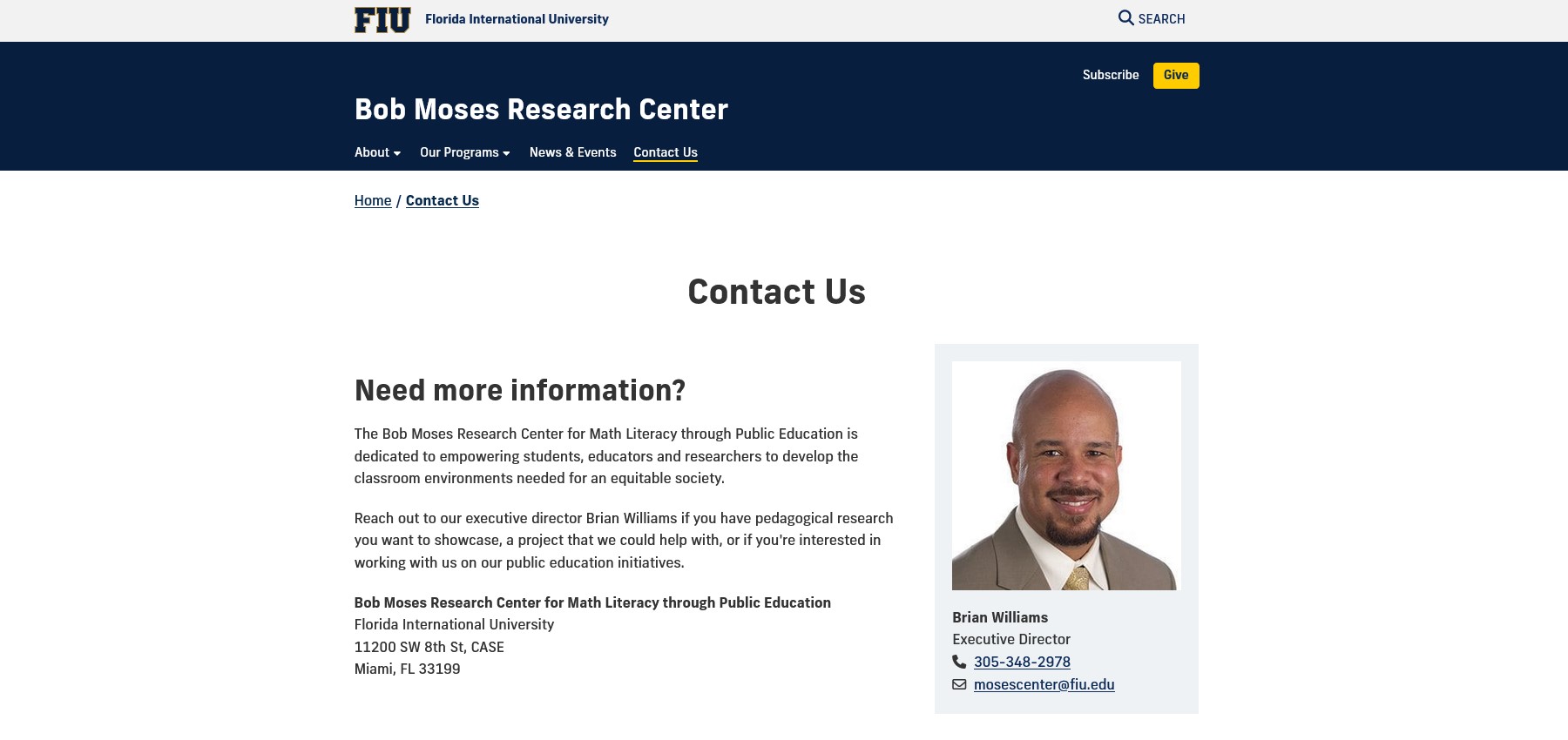
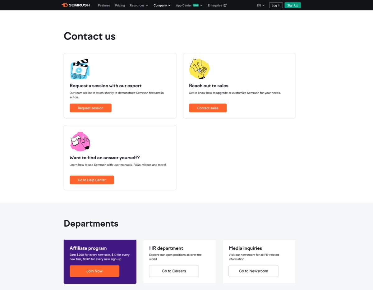
One of the easiest ways to display contact info is by putting it all in one place. Contact pages are a neat, convenient way of telling users "Hey, go here to find who to talk to." It also makes contact information easier to link to throughout your website as needed.
Put 'Contact us' where it can be easily seen.
Your Contact page can only help users if they know where it is! Contact pages are an important and frequent request from users. Consider taking advantage of your navigation's many options to minimize clicks and maximize access.

The primary nav, tertiary nav and site footer are all excellent locations to highlight your Contact page at all times, regardless of what page users are visiting on your website. We do not recommend hiding your Contact page under another section, like About us.
Use content and design to point users toward the right person.
Everyone on your team has a different responsibility. By clarifying who is responsible for what, you ensure users make the best use of their time and your own. You should aim to answer one of the biggest questions users have when they have a concern:
Who do I talk to?
Of course, answering this is straightforward if there is only one main contact in your office. Your job is as simple as labeling someone, "Primary contact." However, if there are multiple contacts depending on the question, you can use titles, headings and other content or design choices on your page to denote their different areas of expertise.

Sprinkling information throughout your website is also helpful, especially in contexts where users might have specific questions.
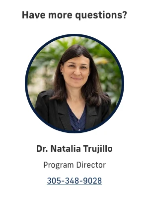
For example, most degree programs will have a director or coordinator serving as a main contact, so putting that person's information on the program page itself is a great idea. Bonus points for including a photo as we've read showing people's photos have a positive impact on a visitor's impression of trustworthiness.
Provide options, not requirements.
Including multiple communication methods on our websites can sometimes block users from information by setting up unnecessary requirements to access it.
This is not to say providing options is bad, just that you should try to have as direct a line of communication as possible. Additional optional features can be very helpful, so long as they are complements to primary methods of reaching your team: email addresses, phone numbers and addresses.

Forms
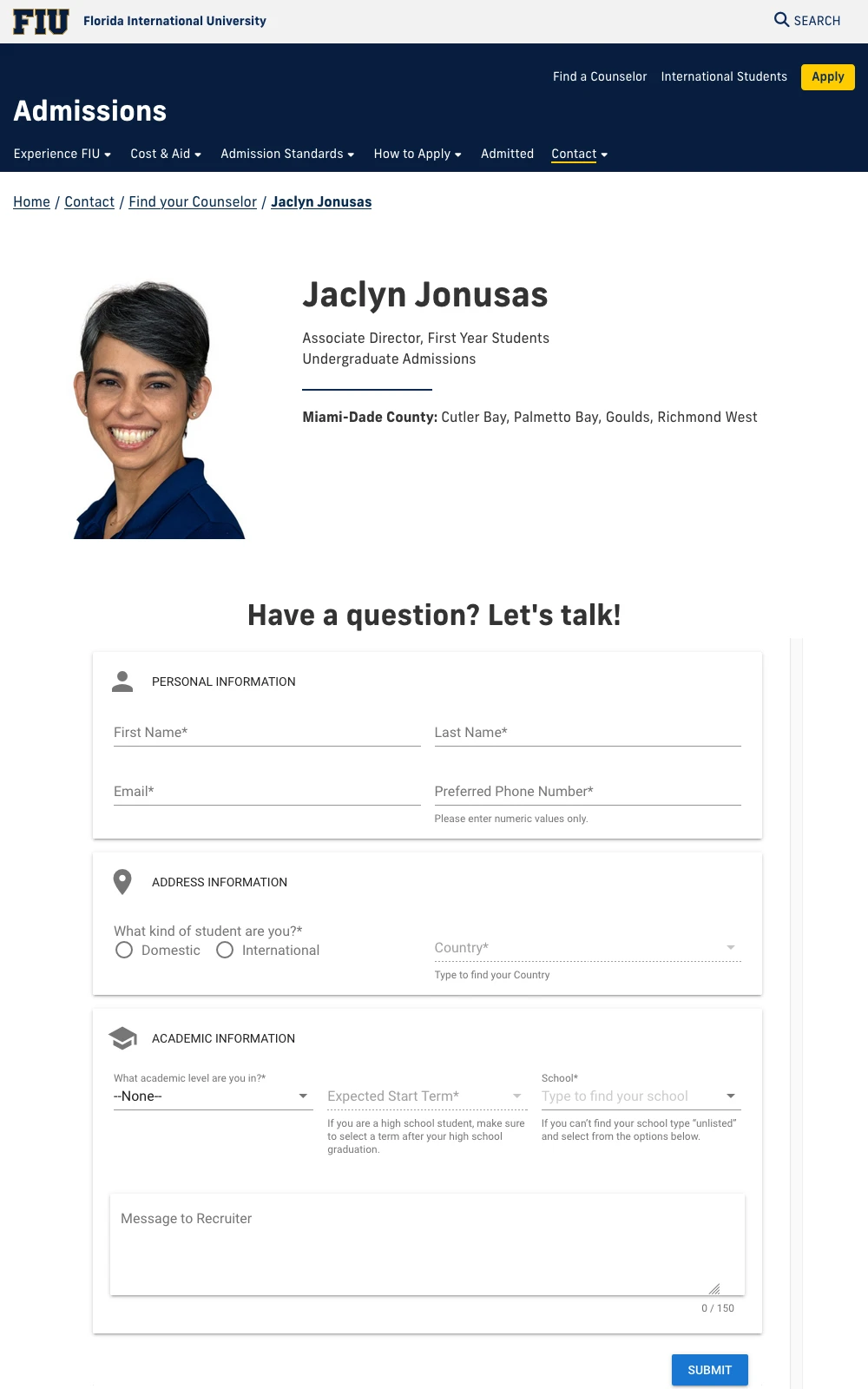
Webforms are a good idea on the surface because they can consolidate and add uniformity to responses.
Unfortunately, they can make users think their questions are being filed away somewhere, rather than being addressed by actual people on your team. This can lead to poorer interaction overall or, worse, no interaction.
It is preferable to provide contact information directly when possible. If you have to use a form, pair it with the contact's photo to soften the blow.
Portals and logins
What could be better than ensuring information only reaches people who need it? You may find that requiring login credentials does the opposite, however. Portals and logins create an unnecessary barrier for users to overcome. Unless the information you're providing is confidential or protected, skip logins whenever you can!
Include relevant and reliable options.
Your team should have an address, email and phone number, but what you maintain beyond that is up to you and the needs of your users. As long as they're optional, users do appreciate more elaborate communication methods. In some cases, users may even prefer using a chatbot over speaking with a person.

Providing extra options for communicating is always welcome. However, make sure all provided options are relevant and responsive. The last thing you want is for someone to use any of your communication options and receive no reply.
The key is to be deliberate about what you're deciding to include on your Contact page. As long as you make yourself easy to reach and describe every option clearly, your users will have a good experience on your website.
What's next?
Our Core template offers a number of options for showcasing contact information, like our Profiles module and accompanying profile pages. In fact, we have a blog post about the importance of profile pages, if you're looking to give your department a face as well as a voice!
With chatbots becoming a bigger part of the digital landscape, we are examining and conducting research to determine the best way to include them on our websites. Be on the lookout for a blog post on implementing this new tool!
