Email isn't dead
Email plays a central role in every office's communication, from file clerks to the C-suite.
The constant emergence of new communication tools has made it very easy to think of email as something obsolete. With a global circulation of about 350 billion emails per day, however, it is safe to say that this tried and tested medium is not going anywhere.
And it's here to stay for good reason! Even up and coming competitors like Slack admit that email continues to hold a place in the modern office as a broad, easy-to-use medium. After all, almost everyone has an email address and almost everyone (hopefully) knows how to use it!
Writing a good email might be similar to writing for the web or writing a social media post, but it's important to consider email's unique advantages (and limitations) the next time you hit send on your company's electronic newsletter.
In this post
- Take advantage of the subject line
- Be concise
- Consolidate emails and release on a schedule
- Use high-quality images (with alt text!)
- Create well-formatted hyperlinks
Take advantage of the subject line
A good email starts with a good subject line. Nielsen Norman Group's research on email subject lines found that users like knowing what an email contains before they open it. The subject line gives you an opportunity to tell readers exactly what to expect from your email.

The Center for Advancement of Teaching tells us all we need to know with its subject line. They avoid generic language and are upfront about the email's content.
It's also important to remember that your subject line is your users' first interaction with your email. Therefore, as much as we want it to be informative, it should also be engaging. A clever or catchy subject line could mean the difference between an informed subscriber and an unread email languishing in the trash bin.
For the more festive users among us, emojis might be a tempting addition to your subject lines. Research shows mixed results on how effective this is at capturing user attention, however, so it might be best to save them for your group chat.
Be concise
Crafting a well-written, well-formatted email comes down to giving users the information they need quickly and efficiently. Users rely on quick scans of emails to decide whether they want to read the content or not.

That does not mean users prefer shorter emails, however. Long emails can be a breeze to read, while short emails can be overly dense. Do what you can to make your emails reader-friendly regardless of length.
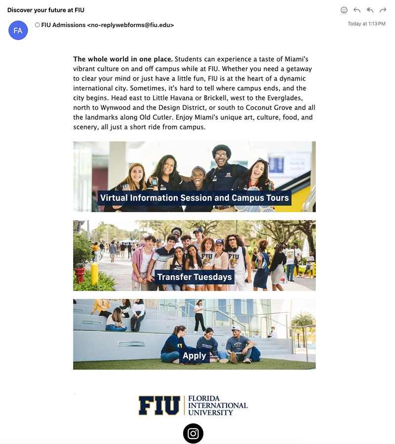
FIU Admissions does an excellent job of making a massive amount of content quite manageable for their readers. They do this by:
- Breaking up large "walls of text" into bite-sized sections
- Using clear headings to enhance scan-friendliness
- Highlighting critical information using bolded text
- Making the most important items come first (the university's #4 ranking)
Consolidate newsletters and keep them on a regular schedule
Why send five tiny emails when you can send one big one? The amount of clicks required to access information is part of being concise and user-friendly. By having everything in one place (with clear headings and good spacing), you can ensure that users have all the information they need upfront and easily available.
Likewise, by sending out newsletters at a regular time, you simplify your workload and simplify the consumption of your newsletters for your users. Instead of receiving small emails trickled in one-by-one throughout the week, they can get a big (and concise) newsletter at the same time, every time.
When to send your newsletter
The best time to send an email comes down to when your users are most actively checking their inboxes. Mailchimp recommends Monday through Friday at 10 a.m. as the optimal time slots for sending your newsletter (with Tuesday through Thursday showing slightly better engagement).
Remember, getting solid newsletter engagement is about tailoring your sending schedule to your audience, which includes their time zones and work habits!
Use small, high-quality images, and don't forget your alt text!
Images are an excellent way to add style to your newsletters. Large amounts of text can benefit from being broken up not just by headings and spacing, but by relevant images that attract user attention.
Don't be too generous with images, however. Mailmodo's article on email newsletter best practices notes that images are best used sparingly. Overloading your email with photos and GIFs makes them distracting rather than helpful. Note that even after you find a high-quality image for your email, it requires a few extra steps to provide the best user experience.

Keep files small
First, try to optimize your images for the web. Minimizing file sizes can improve loading times and provide a better overall experience to your readers with poor or unstable internet connections.
The email shown earlier from FIU Admissions uses images effectively. They're relevant, optimized to have small file sizes and ornament the text without being distracting.
Always remember alt text for accessibility
Alt text is a critical addition for making images accessible to screen readers, providing a concise description of any non-decorative image. Siteimprove's Image Alt Text Best Practices page provides a good breakdown of how to write and add alt text to your images. Remember, this is not just mandatory for many organizations, but an important step for ensuring all readers can enjoy our emails and newsletters.
Be transparent with links and attachments
"Click here."
"Document1.pdf"
"untitled.jpg"
We have all seen these crop up in our emails at some point or another. As common as they may be, these poorly formatted hyperlinks and attachments are not only detrimental to best practices, but potentially dangerous because they normalize hazards like phishing links.
Spam filters operate with a set of rules designed to catch suspicious emails. To put it short, content that looks like spam gets treated like spam, regardless of the intentions behind it. That means your department's picnic announcement may end up in a quarantined trash bin if you include a hyperlinked "Click here."
To avoid these issues, you have two options to provide well-formatted hyperlinks and attachments.
Use transparent language
Just like we did with our subject lines, you can use hyperlink text or file names to describe what is contained within.
If you want users to visit your office's directory, then write "Visit our staff directory" instead of "Click here." If you are sending someone a new employee manual, then name it "new-employee-manual.pdf" instead of leaving a generic name.
After you read this post, for example, I may suggest you check out the rest of our Core Resources Blog.
Expose the URL itself (if it's descriptive)
Alternatively, you can just post the link itself if the URL makes it clear where users are being directed. For example, if I wanted you to send you our blog post on "Five steps for writing better content," I could just send the URL itself: https://core.fiu.edu/blog/2024/five-steps-for-writing-better-content.html. The URL tells you the blog article's website, institution and title just from the link.
Note that exposing the link is not ideal and actually contradicts some of our tips for Writing for the Web. However, if your options come down to exposing the URL or using a "spammy" piece of hyperlinked text, then definitely expose the URL.
What's next?
Be on the lookout for more posts from the DigiComm team about email communications. In the meantime, follow these great resources for up-to-date best practices:
